UI layer architecture for persistent UI elements
Should persistent UI elements be defined at the root level or per-screen?
TJ Dahunsi
May 14 2025 · 14 mins
In mobile apps, certain UI elements persist across the user interface in multiple contexts. This is especially true for UI elements that facilitate navigation, for example:
When building the UI for these screens, there's generally 2 ways they may be laid out:
Root level UI elements: The entire app shares a single instance of these elements in a root level scaffolding layout. On Android, this is typically at an
Activity, orNavHostFragmentlevel.Per-screen UI elements: Each navigation destination is responsible for drawing its own UI elements.
The question therefore is, is one approach generally better than the other? Can they coexist? Satisfyingly, I believe this to be one of the rare cases where the classic software engineering "It depends" response does not apply. I'm firmly of the opinion that for Jetpack Compose apps, the per-screen UI element approach should always be preferred. Let's take a brief walk down memory lane.
Root level UI elements
On Android, one can trace the origin of root level UI elements to the original Activity ActionBar API and the subsequent introduction of the Fragment API. A Fragment could call:
getSupportActionBar()to set the title and otherActionBarattributes in its parentActivity.setHasOptionsMenu()to update the menu items in its parentActivity.
|
|---|
The classic |
This implicitly set up a hierarchical relationship, as the Activity owned the ActionBar. This combined with the move to a single-activity architecture, set the tone for managing top level decor like Floating action buttons, AppBars, and NavigationBars at some root level. This of course came with pros and cons:
Pros
True Persistence: The UI element is the same instance, guaranteeing visual consistency without complex transitions between instances. This was especially beneficial for apps that used floating action buttons, as screen transitions did not introduce UI/UX noise by having a different FAB instance per screen.
Cons
Tight Coupling: Screens become tightly coupled to the host Activity's implementation details and framework APIs.
Complex State Management: The host Activity becomes a bottleneck, needing complex logic to update the title, menu options, FAB visibility/icon/action for each specific screen, especially when the screens are animating. This scales poorly.
Limited Flexibility: It becomes difficult to change the toolbar style, remove it entirely for a specific screen, or handle edge cases without adding more conditional complexity to the host.
Testing Challenges: It is harder to test screens in isolation as they depend on the host
Activityproviding the necessary UI components and configuration hooks.
Per-screen UI elements
The cons of root level UI elements were severe enough that setHasOptionsMenu() for fragments were subsequently deprecated in 2022. Although replacements were provided in the MenuHost and MenuProvider APIs, this mostly serves as a way of preserving backwards compatibility.
Crucially, Jetpack Compose had already hit version 1.1.1, and notably it did not provide an ActionBar, or MenuHost like API. In fact, the closest API introduced to provide the functionality of how to manage the general frame of a navigation destination, is the Scaffold composable. Interestingly enough, it is:
An opinionated implementation in the material3 compose library.
Is a per-screen UI element implementation, providing slots for app bars, floating action buttons and the like.
Implicitly encourages that navigation destinations in the app replace the entire screen content, including its specific appbar, floating action button and so on.
|
|---|
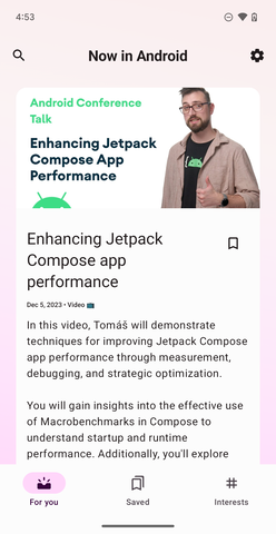
Scaffold in the Now In Android App |
Again, we can list the pros and cons:
Pros
Encapsulation & Modularity: Each navigation destination is self-contained and manages its own UI elements and their state. This promotes the Single Responsibility Principle.
High Flexibility: Navigation destinations can easily customize persistent UI elements without affecting others. Need a completely custom app bar? No problem. Don't need a floating action button? Just don't include it.
Simplified State Management: UI state (title, menu items, navigation bar state) is managed locally within the screen's ViewModel or Composable state, making it easier to reason about.
Improved Testability: Navigation destinations can be tested in isolation much more easily.
Decoupling: Navigation destinations are decoupled from the host Activity regarding these specific UI elements.
Cons
Code Duplication: Without proper structuring, there might be repetition of commonly used UI elements across navigation destinations.
Broken immersion: Making it look like the same appbar or floating action button is smoothly persisting/transforming between screens requires explicit transition handling.
UI layer architecture for persistent UI
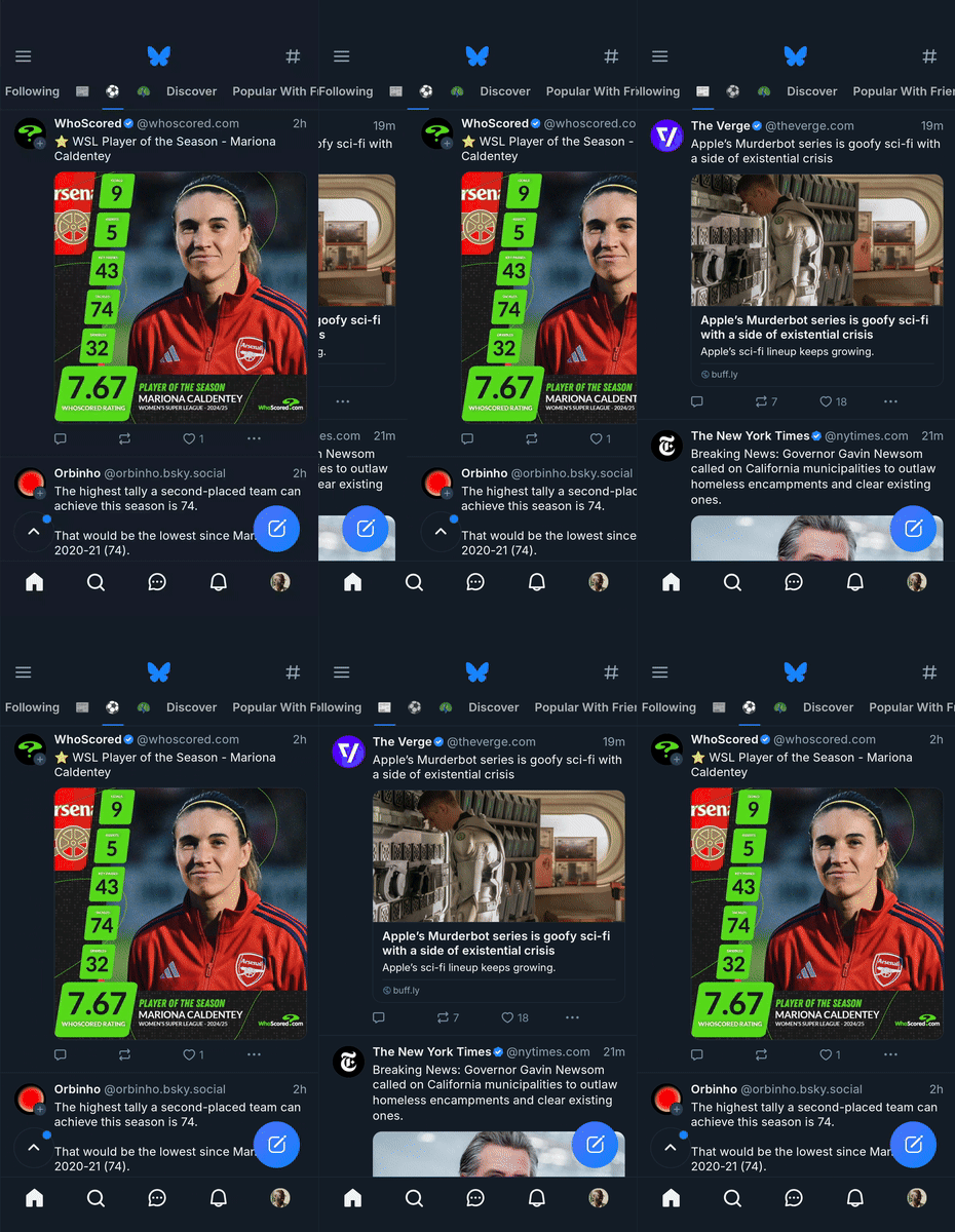
A comparison in the pros and cons list across both implementations would give the impression that whatever benefits we gain in Compose with per-screen UI in reducing complexity, we pay for in actually conveying in the UX that the UI elements are persistent as seen in the screen recording below.
|
|---|
Multiple FABs in the Bluesky App |
However there is an easy solution to this: the Compose shared element transition and Animation Modifier APIs, along with a well designed UI layer architecture.
Persistent UI and UI logic
The entry point to these animation APIs mentioned above are in the scopes they provide: SharedTransitionScope and AnimatedVisibilityScope. For navigation destination transitions, both are almost always used in tandem, and it is really useful to create a UI logic state holder that inherits from both. I personally like to call this a ScaffoldState. This ScaffoldState should be in a common module accessible to all modules in the app that show navigation destinations. I typically call this module scaffold.
The definition for the ScaffoldState can simply be:
class ScaffoldState internal constructor(
    animatedVisibilityScope: AnimatedVisibilityScope,
    sharedTransitionScope: SharedTransitionScope,
    internal val isMediumScreenWidthOrWider: State<Boolean>,
) : AnimatedVisibilityScope by animatedVisibilityScope,
    SharedTransitionScope by sharedTransitionScope {

    internal val canShowBottomNavigation get() = !isMediumScreenWidthOrWider.value

    internal val canShowNavRail get() = isMediumScreenWidthOrWider.value
                                            // implementation omitted
                                            && isAtDeviceEdge
}
The ScaffoldState has an internal constructor, other modules may not create it. Instead they remember instances of it in the composition using a utility method also defined in the scaffold module:
@Composable
fun rememberScaffoldState(
    animatedVisibilityScope: AnimatedVisibilityScope,
    sharedTransitionScope: SharedTransitionScope,
) : ScaffoldState {
    val isMediumScreenWidthOrWider = isMediumScreenWidthOrWider()
    return remember {
        ScaffoldState(
            animatedVisibilityScope = animatedVisibilityScope,
            sharedTransitionScope = sharedTransitionScope,
            isMediumScreenWidthOrWider = isMediumScreenWidthOrWider,
        )
    }
}

@Composable
private fun isMediumScreenWidthOrWider(): State<Boolean> {
    val isMediumScreenWidthOrWider = currentWindowAdaptiveInfo()
        .windowSizeClass
        .isWidthAtLeastBreakpoint(WindowSizeClass.WIDTH_DP_MEDIUM_LOWER_BOUND)

    return rememberUpdatedState(isMediumScreenWidthOrWider)
}
In the above, UI logic defining which navigation UI element is shown is implemented by way of WindowSizeClass in the ScaffoldState. The AnimatedVisibilityScope and SharedTransitionScope parameters are explicitly passed in. The former is typically provided by the navigation library when defining a destination, the latter by a CompositionLocal or prop drilling. An example of using a CompositionLocal is described later.
Persistent UI scaffolding
With the means to remember a ScaffoldState in composition defined, the actual PersistentScaffold Composable follows:
@Composable
fun ScaffoldState.PersistentScaffold(
    modifier: Modifier = Modifier,
    topBar: @Composable ScaffoldState.() -> Unit = {},
    floatingActionButton: @Composable ScaffoldState.() -> Unit = {},
    navigationBar: @Composable ScaffoldState.() -> Unit = {},
    navigationRail: @Composable ScaffoldState.() -> Unit,
    content: @Composable ScaffoldState.(PaddingValues) -> Unit,
) {
    NavigationRailScaffold(
        modifier = modifier,
        navigationRail = navigationRail,
        content = {
            Scaffold(
                modifier = modifier
                    .animateBounds(lookaheadScope = this),
                topBar = {
                    topBar()
                },
                floatingActionButton = {
                    floatingActionButton()
                },
                bottomBar = {
                    navigationBar()
                },
                content = { paddingValues ->
                    content(paddingValues)
                },
            )
        }
    )
}
An intermediate composable is used in the above: NavigationRailScaffold. This is just a simple Row with 2 items, the navigationRail and content:
@Composable
private inline fun NavigationRailScaffold(
    modifier: Modifier = Modifier,
    navigationRail: @Composable () -> Unit,
    content: @Composable () -> Unit,
) {
   Row(
        modifier = modifier,
        content = {
            Box(
                modifier = Modifier
                    .widthIn(max = 80.dp)
                    .zIndex(2f),
            ) {
                navigationRail()
            }
            Box(
                modifier = Modifier
                    .fillMaxSize()
                    .zIndex(1f),
            ) {
                content()
            }
        },
    )
}
Unfortunately, the NavigationSuiteScaffold set of APIs cannot be used here, as unlike the plain Scaffold composable, they do not allow slot access to the persistent UI elements comprising the scaffold, making it impossible to pass Modifier instances to them. This makes the rest of this article inapplicable to NavigationSuiteScaffold.
Persistent UI elements as extensions of UI logic
To provide the illusion of these UI elements persisting from navigation destination to navigation destination, composables for these UI elements can be written as extensions on the ScaffoldState, providing access to the SharedTransitionScope to provide a shared element Modifier for the element. These definitions should also reside in the scaffold module. For example, a PersistentNavigationAppBar could be:
@Composable
fun ScaffoldState.PersistentNavigationBar(
    modifier: Modifier = Modifier,
    enterTransition: EnterTransition = slideInVertically(initialOffsetY = { it }),
    exitTransition: ExitTransition = slideOutVertically(targetOffsetY = { it }),
    content: @Composable RowScope.() -> Unit
) {
   AnimatedVisibility(
       modifier = modifier
            .sharedElement(
                sharedContentState = rememberSharedContentState(
                    BottomNavSharedElementKey
                ),
                animatedVisibilityScope = this,
                zIndexInOverlay = BottomNavSharedElementZIndex,
            ),
        visible = canShowBottomNavigation,
        enter = enterTransition,
        exit = exitTransition,
        content = {
            NavigationBar { ... },
        }
    )
}

private data object BottomNavSharedElementKey
Extensions of the same kind can be written for other persistent UI elements like navigation rails or floating action buttons. Feature modules can then depend on the scaffold module, and use the scaffolding as follows:
    @Composable
    fun FeedRoute(
        viewModel: ListingFeedViewModel,
        // Gotten from navigation library.
        // In Navigation Compose, it is provided in
        // the composable<Destination> { } lambda.
        animatedVisibilityScope: AnimatedVisibilityScope,
        // Passed from the navigation destination declaration.
        sharedTransitionScope: SharedTransitionScope,
    ) { route ->
        rememberScaffoldState(
            animatedVisibilityScope = animatedVisibilityScope,
            sharedTransitionScope = sharedTransitionScope,
        ).PersistentScaffold(
            topBar = {
                TopAppBar(
                    title = {
                        Text(text = stringResource(id = R.string.listing_app))
                    },
                )
            },
            content = { paddingValues ->
                ListingFeedScreen(
                    modifier = Modifier
                        .padding(paddingValues),
                    scaffoldState = this,
                    state = viewModel.state.collectAsStateWithLifecycle().value,
                    actions = viewModel.accept
                )
            },
            navigationBar = {
               PersistentNavigationAppBar(
                    modifier = Modifier
                        .animateEnterExit(
                            enter = slideInVertically(initialOffsetY = { it }),
                            exit = slideOutVertically(targetOffsetY = { it }),
                        )
                )
            },
            navigationRail = {
                PersistentNavigationNavRail()
            }
        )
    }
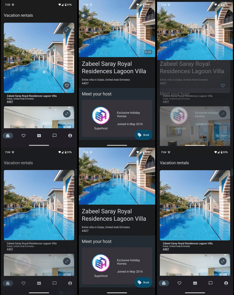
Each API used, and the UI/UX they enable are visualized below:
|
|
|
|---|
From left to right: Persistent UI shared elements across navigation destinations, persistent UI enter and exits across navigation destinations, and persistent UI enter and exits within the same destination.
As seen in the table above, using the ScaffoldState as the UI state holder, allows for tailoring specific Jetpack Compose animation APIs, to their strengths, all while combining them into a cohesive whole. In more detail:
ScaffoldStateandModifier.sharedElement(): Persistent UI elements that are invoked on different navigation destinations will have the shared element APIs preserve visual continuity. In the example shown, each navigation destination is responsible for its own floating action button, yet the illusion of persistence is maintained. In this particular example, the gallery destination scaffold is identical to the detail destination except that it invokes thePersistentFabwith different arguments.ScaffoldStateandAnimatedContent: Invocations of persistent UI elements can useModifier.animateEnterExit()to define anEnterTransitionand/or anExitTransitionfor navigation changes. In this example, the persistent navigation bar animates in and out by sliding vertically. In this particular example, the detail destination scaffold is identical to the feed destination except that it:Does not invoke the
PersistentNavigationAppBar.Invokes the
PersistentFab.
ScaffoldState,AnimatedVisibilityandModifier.animateBounds(): Invocations ofPersistentNavigationAppBarand/orPersistentNavigationNavRailautomatically hide or show based on the currentWindowSizeClass, i.e local screen changes. When either is shown or hidden, thecontentcomposable animates its size and position to accommodate the changes. Users may also pass anEnterTransitionorExitTransitiondirectly to the composable to customize the animations.
Persistent UI and business logic
Persistent UI like navigation bars or navigation rails sometimes have to display state that is far removed from their local contexts; that is business logic. Sometimes, this information can be in a different module. Examples of these include:
Notification badges for unseen notifications.
Unread counts for messages.
User profile alerts or reminders.
In cases like this, your app should have a definition for an AppState. In the Now In Android sample, this is the NiaAppState. When working with persistent UI across navigation destinations, this AppState is crucial as it has access to the app's navigation semantics, and all the resources it may need to populate the current items in the NavigationBar. At its simplest, an AppState may be the following:
@Stable
class AppState(
    private val navigationStateHolder: NavigationStateHolder,
) {
    private val navState by navigationStateHolder.state

    lateinit var sharedTransitionScope: SharedTransitionScope

    val navItems: List<NavItem> get() = navItemsFrom(navState)
}
The AppState is the entry point to things provided at an app level. Your app's navigation state, how many panes your app is capable of showing, and so on reside here. It may require access to business logic and often needs dependency injected data sources. In the Now In Android sample, NiaAppState uses data sources to determine which tabs have notification badges.
To provide state for persistent UI elements from your AppState, ScaffoldState should depend on AppState as an internal implementation detail and as an example of state holder compounding:
class ScaffoldState internal constructor(
    ...
    internal val appState: AppState
) : AnimatedVisibilityScope by animatedVisibilityScope,
    // The SharedTransitionScope is retrieved from the AppState
    SharedTransitionScope by appState.sharedTransitionScope {

    ...

    internal val canShowNavRail
        get() = appState.isInEdgePane && isMediumScreenWidthOrWider.value
}

internal val LocalAppState = staticCompositionLocalOf<AppState> {
    throw IllegalArgumentException("AppState must be provided in the app scaffolding.")
}
To retrieve the AppState for use, there should be an internal LocalAppState definition in the scaffold module, along with an App Composable. This AppState is then provided to the composition tree at the entry point of your app into compose.
@Composable
fun App(
    modifier: Modifier,
    appState: AppState,
) {
    AppTheme {
        Surface {
            // Root LookaheadScope used to anchor all shared element transitions
            SharedTransitionLayout(
                modifier = modifier.fillMaxSize()
            ) {
                // You may opt to hold a reference to the SharedElementTransitionScope
                appState.sharedElementTransitionScope = this@SharedTransitionLayout
                CompositionLocalProvider(
                    LocalAppState provides appState,
                ) {
                    // The rest of your app's UI goes here, things like the `NavHost`
                    // and so on.
                    ...
                }
            }
        }
    }
}

internal val LocalAppState = staticCompositionLocalOf<AppState> {
    throw IllegalStateException("CompositionLocal LocalAppState not present")
}
In Android apps, use of the above will be in the Activity, resembling the following:
class MainActivity : ComponentActivity() {
    override fun onCreate(savedInstanceState: Bundle?) {
        enableEdgeToEdge()
        super.onCreate(savedInstanceState)

        // Create your app state here. If it needs dependency injected data sources
        // or access to a nav controller or navigation state, provide it here as well
        // or in Composition.

        val appState: AppState = ...

        setContent {
            App(
                modifier = Modifier,
                appState = appState,
            )
        }
    }
}
Next, the call-site for remembering the ScaffoldState would then be updated to:
@Composable
fun rememberScaffoldState(
    // This is provided by the navigation library
    animatedVisibilityScope: AnimatedVisibilityScope,
) : ScaffoldState {
    val isMediumScreenWidthOrWider = isMediumScreenWidthOrWider
    val appState = LocalAppState.current
    return remember {
        ScaffoldState(
            animatedVisibilityScope = animatedVisibilityScope,
            isMediumScreenWidthOrWider = isMediumScreenWidthOrWider,
            // SharedTransitionScope is now provided by the AppState
            appState = appState,
        )
    }
}
Leaving the declaration of the PersistentNavigationAppBar only needing to specify the Modifier or transitions to run:
fun ScaffoldState.PersistentNavigationAppBar(
    modifier: Modifier = Modifier,
    ...,
) {
    AnimatedVisibility(
       modifier = modifier
            .sharedElement(...),
        ...,
        content = {
            NavigationBar {
                val appState = LocalAppState.current
                appState.navItems.forEach { item ->
                    NavigationBarItem(...)
                }
            }
        },
    )
}
True persistent UI
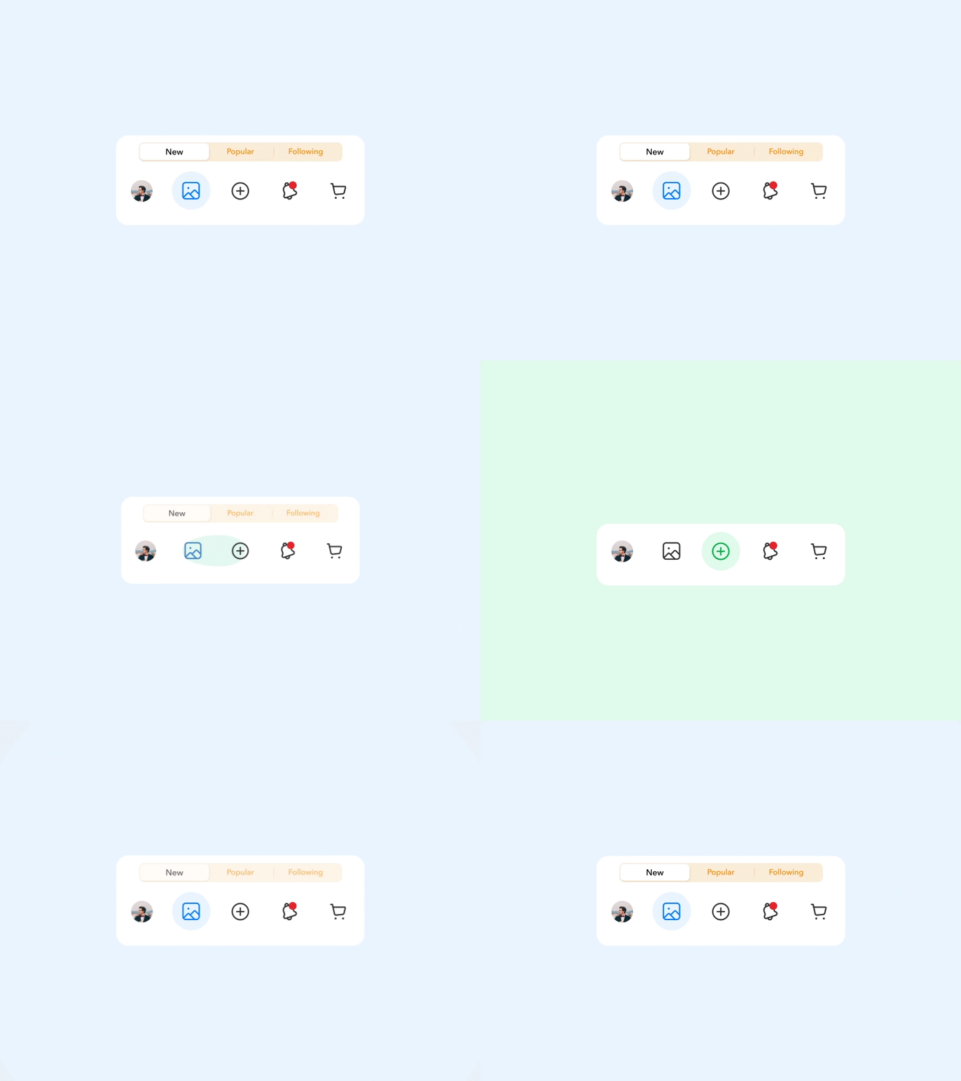
In cases where there is some local transient state in the persistent UI element that can't be preserved with just a shared element, a movable shared element can be used. Consider this navigation bar design described and implemented here, where there's an animation between the tabs when a tab is selected:
|
|---|
Local transient animations in a navigation bar |
Illusions can only go so far, and at this point there is the need for true persistence. This is achieved by adding the movableContentOf API to create a movable shared element. That is, the architecture will hoist more that just UI state, but will hoist the entire UI element and its state. To learn more about why movableContentOf is needed at this juncture, please read the following article detailing the concept of compositional permanence:
When using movableContentOf in Compose, care must be taken to ensure the movable content is composed in exactly one place at a time. For example, when navigating from destination A to destination B, there are 2 destination composables coexisting for the duration of the animation:
Destination A animating out.
Destination B animating in.
As soon as the animation starts, the movable NavigationBar must immediately be swapped with a decoy NavigationBar in destination A, while simultaneously, it must immediately start being composed in destination B. The following outlines the UI logic for achieving this.
Defining movable persistent UI
The ScaffoldState NavigationBar first has its declaration split. The part that depends only on the AppState is written as an extension on the AppState alone:
@Composable
internal fun AppState.NavigationBar(
    modifier: Modifier = Modifier,
) {
    NavigationBar(
        modifier = modifier,
    ) {
        navItems.forEach { item ->
            NavigationBarItem(...)
        }
    }
}
Hoisting movable persistent UI
A truly persistent NavigationBar is hoisted to the AppState using movableContentOf:
class AppState(
    ...
) {
    internal val movableNavigationBar = movableContentOf<Modifier> { modifier ->
        NavigationBar(
            modifier = modifier,
        )
    }
}
UI logic for movable persistent UI
With the movable NavigationBar defined, the logic for determining when it can be safely composed is added to the ScaffoldState:
class ScaffoldState internal constructor(
    ...
    internal val appState: AppState
) : AnimatedVisibilityScope by animatedVisibilityScope,
    SharedTransitionScope by appState.sharedTransitionScope {

    internal val canShowNavigationBar get() = !isMediumScreenWidthOrWider

    internal val canUseMovableNavigationBar
        // Read the transition target state from the AnimatedVisibilityScope
        get() = canShowNavigationBar && transition.targetState == EnterExitState.Visible
}
Composing movable persistent UI
Finally, in the public extension method on the ScaffoldState, swap between the persistent UI element in the AppState or its decoy based on UI logic defined in the ScaffoldState:
@Composable
fun ScaffoldState.PeristentNavigationBar(
    modifier: Modifier = Modifier,
    ...
) {
    AnimatedVisibility(
        modifier = modifier
            .sharedElement(...),
        visible = canShowNavigationBar,
        ...
        content = {
            if (canUseMovableNavigationBar) appState.movableNavigationBar(
                Modifier,
            )
            else appState.NavigationBar(
                modifier = Modifier,
            )
        },
    )
}
The result of which is shown below:
|
|---|
Preserved local transient animations in a navigation bar with |
Round up
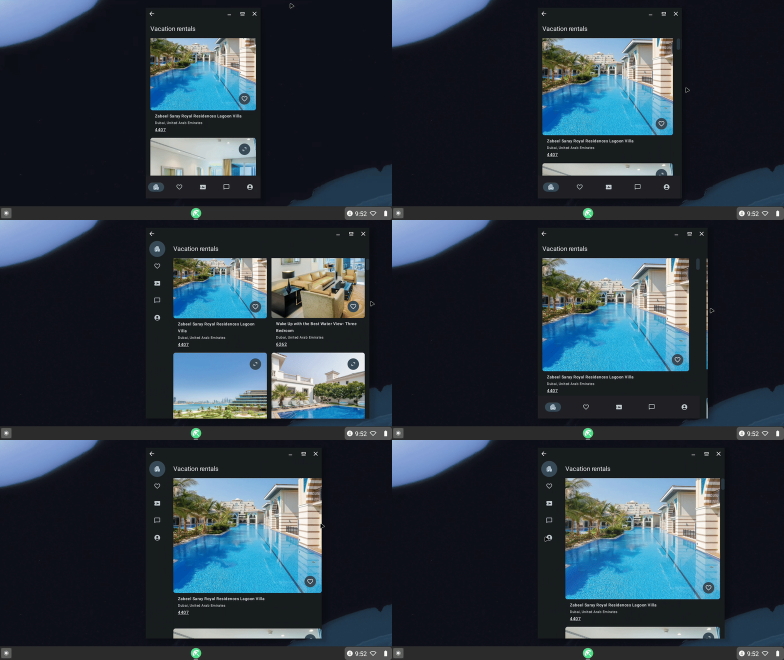
The above describes an architectural pattern for persistent UI for apps. The great part about this architecture is that it also scales to tablet and desktop form factors; this will be covered in a subsequent blog post.
To recap, the architecture defined allows for:
Navigation destination control of persistent UI animations for local changes within a navigation destination like window size changes.
Navigation destination control of persistent UI animations for navigation changes across navigation destinations.
Full customization per navigation destination on which UI elements are persistent, and which ones are not.
A pattern of describing persistent UI elements as a function of the
ScaffoldStateof a navigation destination.The ability to hoist persistent UI elements to the
AppStatefor UI elements with internal transient state that drive animations that can't be approximated with shared element transitions between separate instances.The practice of having a
scaffoldmodule or similar for disseminating fine grained control ofAppStateto navigation destinations.
An example of the above in an app with a scaffold module, AppState and per navigation destination customization can be seen below.

