Shared element transitions for large screened devices
Scaling up shared element transitions to the big screen
TJ Dahunsi
Dec 08 2025 · 10 mins
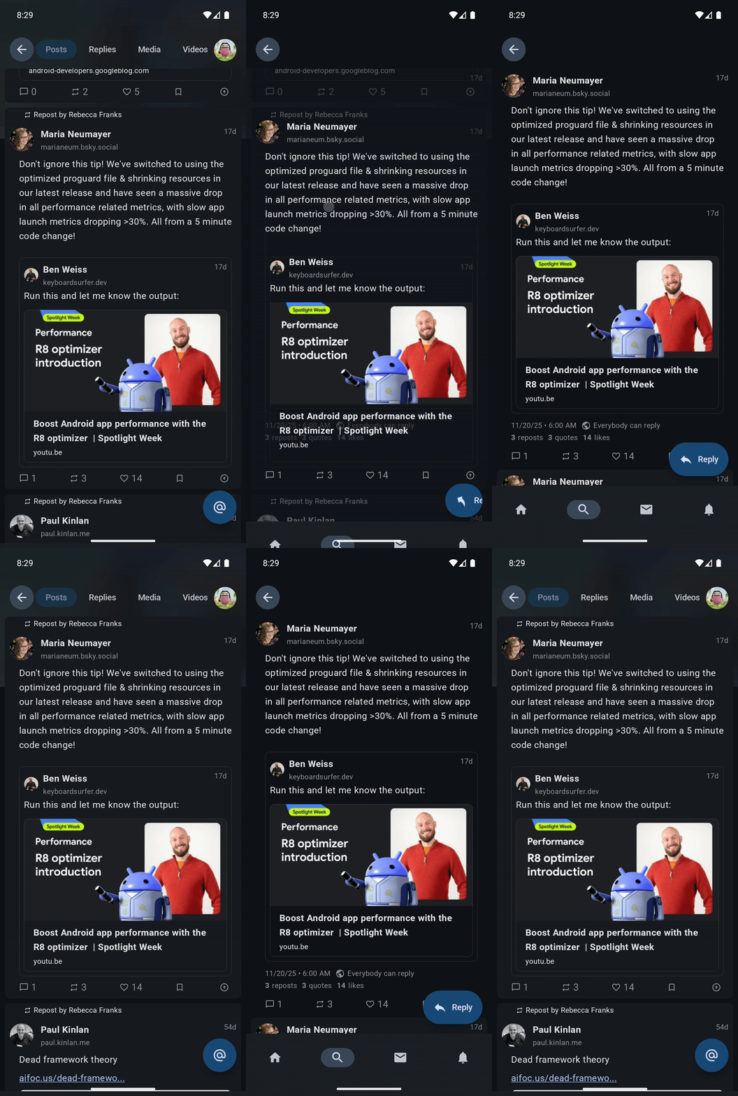
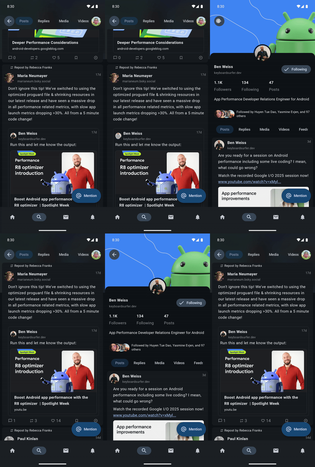
In UIs with hierarchical data that allow users to dive deeper into content, shared element transitions arguably move from nice to have, to essential for communicating spatial context, guiding the user's eye, and making an app feel like a cohesive physical space rather than a stack of unrelated screens:
Shared element on a post | Shared element on a quoted post | Shared element on a post author |
|---|---|---|
|
|
|
With Jetpack Compose, the shared element APIs have made implementing these transitions significantly easier. However, if you are scaling your app up for large screens (foldables, tablets, or desktop), a subtlety in the shared element transition APIs may have left you puzzled. The standard API behaves perfectly on a phone but can disappear, or cause layout conflicts in large screen layouts when trying to show shared elements with the same keys simultaneously in the same target state.
Here is why that happens, and the specific architectural pattern you need to solve it.
Larger screens, larger problems
On large screens, navigation often results in the shared element needing to exist in multiple places both during and after the transition. Consider these two common scenarios:
List -> List & Detail: The user clicks an item in a list navigation entry (the solitary navigation entry). This causes the detail navigation entry to open at the right side of the display. The list entry shifts to the left display and stays on screen. There are now two navigation entries visible in the display, one on the left and the other on the right. Each entry shows the same shared element with the same key.
List & Detail Dives: The user taps an item on the detail entry (right side of the display), navigating deeper in the app. The detail entry now shifts to the left side from the right, and the new content enters into the right side of the display. Again each entry shows the same shared element with the same key.
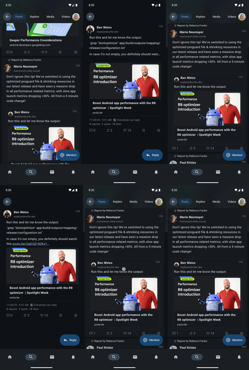
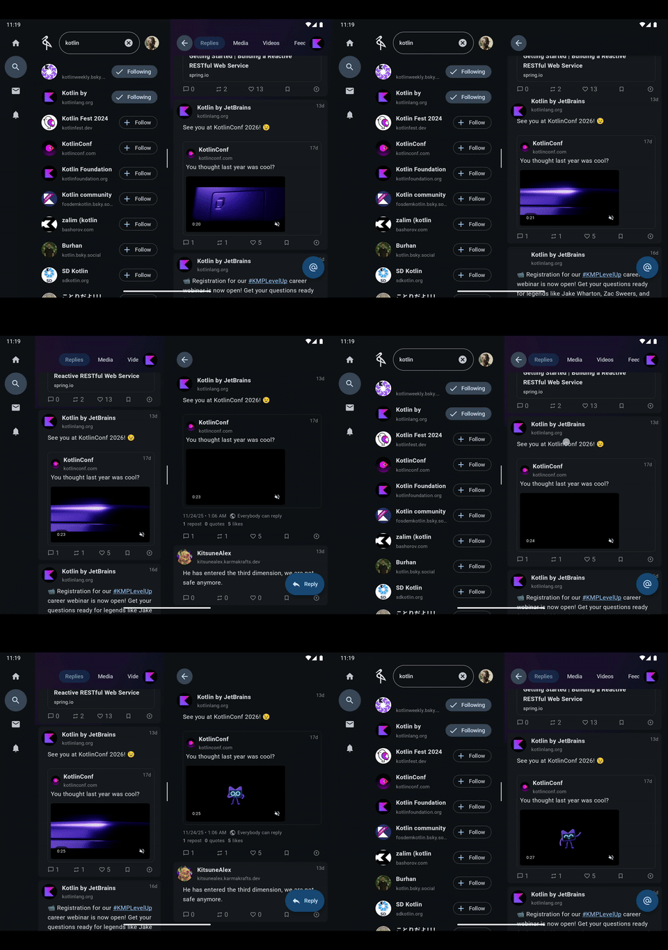
In these cases, the standard shared element transition API forces a choice: show the element in the navigation entry that starts the transition and not animate during the transition OR show it in the incoming entry, and leave a hole at the source.
Shared element animation breaking during a List -> List & Detail transition |
|---|
|
Shared element transitions and the rule of two
There are two shared element APIs that specifically deal with showing identical visual content:
Modifier.sharedElementModifier.sharedElementWithUserManagedVisibility
These APIs, much like the Sith, only allow for two matched elements during a transition:
The invisible element: This element has its bounds tracked, and is used as the origin of the shared element transition. During the transition, the element is deliberately made not to be visible.
Modifier.sharedElement: This is the element rendered in theAnimatedVisibilityScopewhoseTransitionhasTransition.targetStateequal toEnterExitState.PostExitduring the transition.Modifier.sharedElementWithUserManagedVisibility: This is the element where theModifierhas theisVisibleflag passed to it asfalse.
The visible element: This element has its bounds set to the invisible element at the start of the transition. During the transition, it has its bounds animated to its final position.
Modifier.sharedElement: This is the element rendered in theAnimatedVisibilityScopewhoseTransitionhasTransition.targetStateequal toEnterExitState.Visible.Modifier.sharedElementWithUserManagedVisibility: This is the one where theModifierhas theisVisibleflag passed to it astrue.
On a standard phone, this logic is actually a feature. When navigating from Screen A to Screen B, Screen A disappears as Screen B appears. We want the element on Screen A to hide so that the copy on Screen B can take over and animate into place. Having both elements on the screen can result in visual noise.
On large screens however, if the NavEntry that initiated the transition does not leave, we need a way for the shared element to participate in the transition without destroying its source.
Solution: A Composable Sandwich
To solve this visual problem, we need to decompose the shared element transition API. The API currently manages two things:
Bounds tracking logic: It tracks where an element is, and animates it to where it will be using low level lookahead APIs.
Rendering logic: Selectively showing an element depending on its target state.
Of these two, only the first is entirely too much work. We can manage the second ourselves, and somewhat trivially too. i.e, we need the sharedElement modifier to calculate where the element is (bounds tracking) and to animate it, but we don't want it to control if the element is drawn.
We achieve this by creating a "Composable Sandwich". Instead of applying the modifier directly to the composable we want to render, we apply it to a parent container. Then, we conditionally render the actual content either as:
A child of the parent container if we want it both animated and visible.
A sibling of the parent container if we only want it visible.
Bounds tracking logic
The sandwich has 3 parts:
The Wrapping Composable: A parent
Boxthat handles the placement and sizing of the component within the UI.The Tracking Composable: A
Boxinside the wrapper that holds the shared elementModifier. Its only job is to allow the shared element API to track its bounds and animate it.The Content Composable: The actual UI (Image, Text, etc.).
Since there are two shared element Modifier APIs, there are two sandwich implementations.
First, shared elements:
@Composable
inline fun SharedTransitionScope.SharedElement(
    modifier: Modifier,
    sharedContentState: SharedContentState,
    animatedVisibilityScope: AnimatedVisibilityScope,
    placeholderSize: PlaceholderSize,
    renderInOverlayDuringTransition: Boolean,
    zIndexInOverlay: Float,
    clipInOverlayDuringTransition: OverlayClip,
    crossinline content: @Composable () -> Unit,
) {
    // 1. The Wrapper: Handles placement and sizing in the layout
    Box(modifier) {
        val visible = animatedVisibilityScope.transition.targetState == EnterExitState.Visible
        Box(
            // 2. The Tracker: Holds the shared element key and bounds
            Modifier
                .sharedElement(
                    sharedContentState = sharedContentState,
                    animatedVisibilityScope = animatedVisibilityScope,
                    placeholderSize = placeholderSize,
                    renderInOverlayDuringTransition = renderInOverlayDuringTransition,
                    zIndexInOverlay = zIndexInOverlay,
                    clipInOverlayDuringTransition = clipInOverlayDuringTransition,
                )
                .fillSharedElement()
        ) {
            // 3a. The shared element if it is visible and animating
            if (visible) content()
        }
        // 3b. The shared element if it is just visible
        if (!visible) content()
    }
}
Next, shared elements with user managed visibility:
@Composable
inline fun SharedTransitionScope.SharedElementWithCallerManagedVisibility(
    modifier: Modifier,
    sharedContentState: SharedContentState,
    placeholderSize: PlaceholderSize,
    renderInOverlayDuringTransition: Boolean,
    zIndexInOverlay: Float,
    clipInOverlayDuringTransition: OverlayClip,
    isVisible: () -> Boolean,
    crossinline content: @Composable () -> Unit,
) {
    // 1. The Wrapper: Handles placement and sizing in the layout
    Box(modifier) {
        val visible = isVisible()
        Box(
            // 2. The Tracker: Holds the shared element key and bounds
            Modifier
                .sharedElementWithCallerManagedVisibility(
                    sharedContentState = sharedContentState,
                    visible = visible,
                    placeholderSize = placeholderSize,
                    renderInOverlayDuringTransition = renderInOverlayDuringTransition,
                    zIndexInOverlay = zIndexInOverlay,
                    clipInOverlayDuringTransition = clipInOverlayDuringTransition,
                )
                .fillSharedElement()
        ) {
            // 3a. The shared element if it is visible and animating
            if (visible) content()
        }
        // 3b. The shared element if it is just visible
        if (!visible) content()
    }
}
The sandwich API ends up having the same arguments as the vanilla shared element transition API. All functionality from the original API is preserved, successfully detaching the bounds tracking logic from the rendering logic.
There is a small caveat. The size and placement Modifier chain isn't placed on the content itself, but on a parent. The content then has Modifier.fillSharedElement() applied to it to fill that parent. The definition of Modifier.fillSharedElement() follows:
   fun Modifier.fillSharedElement() = this.then(FillSharedElement)

    val FillSharedElement = Modifier
        .layout { measurable, constraints ->
            val placeable = measurable.measure(
                constraints.copy(
                    minWidth = when {
                        constraints.hasBoundedWidth -> constraints.maxWidth
                        else -> constraints.minWidth
                    },
                    minHeight = when {
                        constraints.hasBoundedHeight -> constraints.maxHeight
                        else -> constraints.minHeight
                    }
                )
            )
            layout(
                width = placeable.width,
                height = placeable.height
            ) {
                placeable.place(0, 0)
            }
        }
Rendering logic: The Three-Body (or more) Problem
The "Composable Sandwich" successfully splits bounds tracking from rendering logic; the next step then, is to apply that rendering logic.
The rule to apply is simple: For scenarios where two or more elements with the same shared element key exist in the same target state (i.e there are 3 more more shared elements with the same key in the transition), one element must be chosen to be the source of the transition, another element must be chosen to be the target of the transition, and the others must be relegated to simply being visible. Since there are two shared element transition APIs, relegating an element to just being visible has two approaches:
SharedElement: The element being relegated must be passed a staticAnimatedVisibilityScopethat perpetually has itsTransition.targetStateset toEnterExitState.PostExit. This will allow the shared element transition API to match only with the element that should animate during the transition.SharedElementWithUserManagedVisibility: This case is significantly more straightforward. The relegated element should just always passfalsetoSharedTransitionScope.SharedElementWithCallerManagedVisibility.
For SharedElement(), the static AnimatedVisibilityScope is defined as follows:
@Composable
private fun rememberStaticExitedAnimatedVisibilityScope(): AnimatedVisibilityScope {
    val transition = rememberTransition(
        MutableTransitionState(
            initialState = EnterExitState.PostExit
        )
    )
    return remember(transition) {
        object: AnimatedVisibilityScope {
            val transition get() = transition
        }
    }
}
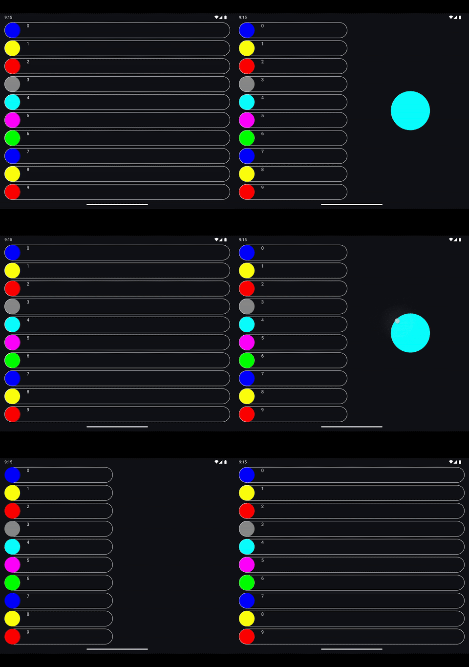
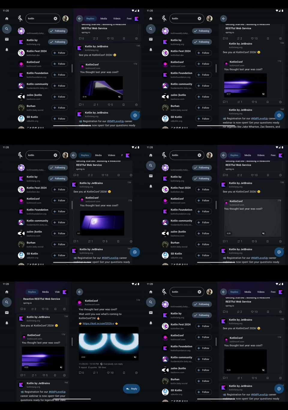
The result of the above is in the screen recording below, shared elements on large screens where two shared elements with the same key are visible in the same target state at the same time:
Large screen shared element transitions using the sandwich pattern |
|---|
|
If you'd like to run the code that provided the output above, its full source is available in this github gist.
Architecture
To use this approach in a real world app, the UI layer architecture should have a means of tagging the slots available in the display and assigning a sort of priority to certain slots for navigation entries in terms of shared elements. Earlier this year at Droidcon NYC, I outlined an architectural approach for building adaptive apps with Jetpack Compose, that is applicable here:
In the video above, each slot a navigation entry can occupy is called a pane. In a two pane app, the panes available are the Primary and Secondary pane, and the bias is to always animate the shared element in the Primary pane as seen in the screen recording below:
Large screen shared elements on a post | Large screen shared elements on a quoted post |
|---|---|
|
|
Ultimately, there are three roles to play:
The source: This is the starting element, the one visible before the transition starts.
SharedElement: It doesn't need any special handling, it's simply passed the existingAnimatedVisibilityScope. During the transition, itsTransition.targetStatewill already beEnterExitState.PostExitwith no input.SharedElementWithUserManagedVisibility: TheisVisibleflag is initially set totruebefore the transition starts, and then set tofalseto trigger the transition.
The target: This is the element that should be animated during the transition.
SharedElement: It must receive the activeAnimatedVisibilityScopewhere thetargetStateisEnterExitState.Visible.SharedElementWithUserManagedVisibility: TheisVisibleflag is flipped fromfalsetotrueto trigger the transition matching it with the source element.
The others: Any other instances either that should be visible, but should not participate in the transition. Depending on the API used, all of these must either:
SharedElement: It must be passed anAnimatedVisibilityScopewithTransition.targetStateEnterExitState.PostExitusing an API likerememberStaticExitedAnimatedVisibilityScope()defined above.SharedElementWithUserManagedVisibility: TheisVisibleflag is perpetually set tofalse, effectively rendering it inert and non-participatory in the transition.
Conclusion
The Composable Sandwich pattern for shared elements effectively lets you decouple bounds tracking from visibility control for shared elements, providing total control over adaptive transitions. This approach allows your app to scale gracefully from a phone screen to a desktop window, maintaining the high-quality feel of shared element transitions regardless of the form factor.
That said, as this use case becomes more and more common, the official shared element APIs may allow for manual control of visibility for shared elements. In Compose 1.10, the SharedContentConfig API was added to the shared element API to allow for customizing its behavior; this may be a good place to allow for visibility control. Time will tell, but until then, might as well go big or go home and have a sandwich.
